

There are two colours on the screen: petrol blue on the left, rust red on the right. A sharp line runs between them, kinked in places but always precise. Three arrows show the direction of advance. A number glows in the corner: one side controls 61.4 per cent of the area being tracked, the other 38.6 per cent. The map feels calm—like the closing balance sheet of a war.
Now let us move to a single place crossed by that line.
There is a narrow road between a forest and a handful of houses. A small unit from one side holds the western edge of the village. During the day it can reach the crossroads; at night it withdraws to cover. The other side is not permanently present in the village, but watches the approach road with drones and can strike it with artillery. A supply route runs behind the forest, usable only intermittently. Local residents still live in several cellars. They know when the road is relatively passable, but not who it will belong to six hours later. No one can safely enter the strip of fields between the two positions.
On the map, this place must be petrol blue, rust red or grey. On the ground, it is none of those things. It is at once a space of presence, range, risk, movement, observation, administration and uncertainty. One colour is not enough.
This is where the problem begins: a war map does not depict control itself. It depicts a decision about how control will be defined for the purposes of the map.
01 What does it actually mean to “control territory”?
The word control sounds like a switch: either on or off. Either one side holds the territory, or the other does. In reality, it is better understood as a bundle of different capabilities that may overlap, diverge and change over the course of a day.
Physical presence means that personnel or equipment belonging to one side are present at the location. It says nothing by itself about whether they can remain there. A brief patrol, a reconnaissance incursion or a house occupied for several hours is not the same as enduring control of an area.
Sustained control presupposes the ability to supply a position, rotate personnel, defend it and restore a presence after an attack. Control therefore means more than reaching a place. It means being able to return repeatedly and bear the costs that this entails.
Freedom of movement is another distinct layer. One side may have a position in the village yet be unable to use the road leading to it safely. The other side may be physically farther away but still observe, disrupt or constrain movement along that road. Who, then, controls the village: the side standing in it, or the side deciding when it can be reached?
Control by fire does not require occupation. Terrain can be kept under observation and within weapons range so that an adversary may enter it but cannot use it routinely. Conversely, weapons range alone does not amount to effective control over every point inside a circle on a map. Visibility, accuracy, available assets, response time, cover and many other variables all matter.
Administrative control exists on another plane: who issues documents, runs the local office, organises policing, collects fees, keeps schools operating, records property or settles disputes? In an irregular conflict, an administrative network may function where military presence is discontinuous. Conversely, a unit may occupy the town square without controlling local institutions or information.
Control of main routes may matter more than holding the surrounding area. A bridge, railway junction, mountain pass or the only usable road connects supply, evacuation and movement. Military geography therefore distinguishes ordinary ground from key terrain: some places confer a disproportionate advantage because they govern access, observation or transport.[4]
Local resistance and the information environment can undermine official control. A local network may pass information, hide people, refuse cooperation or, conversely, enable administration without a large military presence. The colour of a territory therefore does not tell us whether power is accepted, merely tolerated or imposed.
Finally, there are contested, buffer and effectively inaccessible zones. They are not “empty”. They may be watched, mined, shelled, visited intermittently or used only at particular times. What they share is that no side can routinely exercise all components of control there at once.
Control is not a point on a scale from zero to one hundred. It is a profile of capabilities: to be present, endure, move, prevent the other side from moving, administer, supply and gather information.
Political-science research on civil wars therefore often uses more than a simple “government versus rebels” binary. It distinguishes several levels, from complete control by one side through varying degrees of contestation to complete control by the other. Control itself is often treated as a latent state that cannot be measured directly; it is inferred from observable events and behaviour.[7] The map turns that estimate back into a colour.
One territory, eight different answers
A schematic profile of a fictional sector. Bar lengths are illustrative only—they are neither percentages nor data from a real conflict.
02 A model is not a lie. A model is a reduction.
The International Cartographic Association defines a map as a symbolised representation of geographic reality that depicts selected features and is produced through the decisions of its author.[1] Selection is therefore not a flaw that accidentally found its way into the map. It is a condition of the map’s existence.
If a map showed every house, every tree, every movement, every patrol, every instance of signal interference, every unverified report, every moment and every possible interpretation, it would cease to be a map. It would become an unusable warehouse of data. For space to become intelligible, some information must be emphasised, some combined and some removed.
The US Geological Survey describes cartographic generalisation in precisely these terms: at a smaller scale covering a larger area, information and detail must be reduced so that the representation remains legible.[2] A road is straightened. Several buildings become a point. A forest receives a single fill. An irregular belt of uncertainty becomes a line.
A model is a reduction.
The question is not whether a map simplifies reality. The question is whether we know what this particular map has simplified.
A good map is not one that contains everything. A good map contains the right things for a particular question. A strategic map may clearly show the overall direction of change. An operational map may emphasise routes, hubs and terrain obstacles. A local map may show individual edges of built-up areas, copses and passages. Each will look different, yet all can be honest.
The problem arises when an answer designed for one question is used as an answer to another. A map suited to saying “which side has the advantage in this region” may be unable to tell us “who can safely travel along this road tonight”. Yet our minds readily read it as though it said both.
03 A line that has to run somewhere
The front line is often the strongest element on the entire map. It separates colours, closes shapes and creates the impression that a physical boundary like a wall exists at every point along it. In some places that may be reasonably close to reality: continuous defensive positions, obstacles and persistently observed ground can produce a distinct line of contact. Elsewhere, however, the “front” resembles a broad belt of varying risk and incomplete presence.
An analyst does not usually observe a line. The analyst observes individual indications: the location of a unit at a particular time, a geolocated recording, movement along a road, an abandoned position, a report of an attack, a change in administrative activity or the prolonged absence of an adversary. A continuous boundary must be inferred from these points. The line is therefore the result of classification and interpolation. It is a conclusion drawn between observations.
Its position also depends on the rule chosen. Do we draw it at the furthest confirmed presence? Along the last sustainable positions? Around the area in which manoeuvre is safe? On the centre line between defensive belts? Each option answers a slightly different question.
A more candid map may replace the line with an uncertainty band, hatching or several levels of transparency. But that, too, carries a cost. The more uncertainty a map displays, the harder it becomes to read. Research on cartographic uncertainty has long stressed that data quality and uncertainty should be communicated visually, especially where decisions are made from maps under time pressure.[5][6] At the same time, every additional texture, blur or layer imposes another demand on attention.
The clean line is therefore seductive not only politically, but cognitively. It is fast. It instantly declares what lies “on one side” and what lies “on the other”. Yet its legibility can easily be mistaken for precision.
04 Zoom in, and the front dissolves into a system
Historical maps of trench warfare reveal what scale does to the idea of a single line. On an overview map of the First World War’s Western Front, a long section can be shown as an almost continuous line. The Library of Congress collection, however, preserves 156 maps at a scale of 1:10,000, made from aerial photographs and observation. They show trenches, wire obstacles, roads, airfields, depots and other positions.[9]
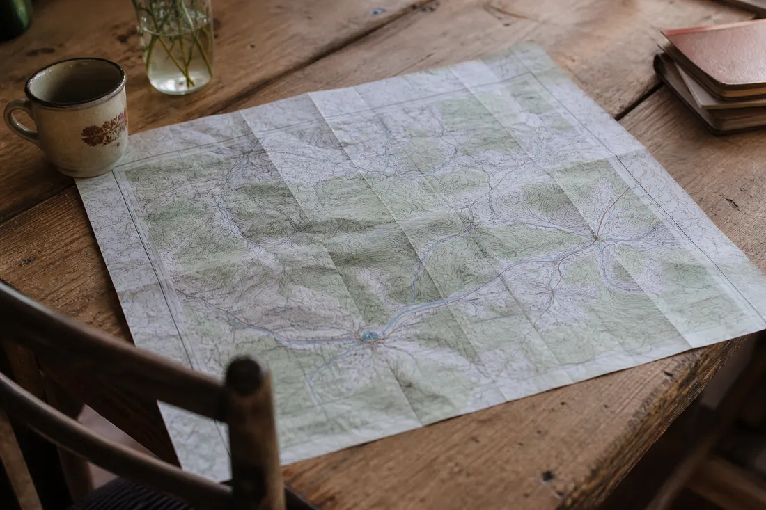
On those maps, the “front” is not a single line. It is infrastructure: a forward trench, support lines, communication trenches, firing positions, obstacles, dead ground and routes. From a distance, this system has to be compressed into one symbol. Up close, it becomes clear that between the two colours lies a space in which every separate use of the terrain is contested.
The same is true outside trench warfare, though in different forms. In a civil war, state administration may function in a district centre while rural roads are dangerous at night. In mountainous terrain, a valley may be passable while the slopes are observed by the other side. In a city, changing control of a single bridge or passage can reshape the logistics of an entire neighbourhood without producing a visibly large territorial change on an overview map.
Scale determines more than the amount of detail. It also determines what we are willing to call the same phenomenon.
05 Colours are not neutral containers
Colour on a map does more than explain a category. It creates a sense of ownership. A fully saturated area looks complete, as though every metre inside it were subject to the same power. Its edges appear precise, its interior homogeneous, and empty spaces seem not to exist.
Cartography distinguishes among several types of colour scheme. Sequential scales suggest movement from a low to a high value; diverging scales emphasise departure in two directions from a meaningful midpoint; qualitative palettes distinguish categories without claiming that one is “more” than another.[10] Using only two contrasting colours for contested territory is therefore not merely an aesthetic decision. It asserts that reality consists of two mutually exclusive classes.
A grey or hatched zone may acknowledge uncertainty, but it too carries meaning. Grey can look like “no man’s land” even though people may live there, local authorities may function and several armed actors may operate. Transparency may indicate weak control, low confidence in the source, or simply a graphic attempt to preserve the basemap. Without a legend, the reader cannot know which of these meanings applies.
Military symbols have a standardised grammar. MIL-STD-2525, for example, establishes rules for joint military symbology so that different systems and users interpret the same signs consistently.[3] The standard governs how information is written down, not whether the information itself is complete and correct. A precisely drawn symbol may still rest on an uncertain observation.
Arrows work in a similar way. Their heads suggest direction, their length reach and their width strength. But readers must know whether an arrow marks confirmed movement, a reported attack, a possible direction, a planned intention or merely a graphic summary of change between two dates. Without that information, a hypothesis can easily dress itself up as an event.
06 Percentages of territory: precision that may be measuring something else
The statement “2.3 per cent of territory gained” looks more objective than a coloured area. In fact, it conceals several decisions. What is the denominator—the whole country, an administrative region, territory originally held, or the area selected for observation? How are contested zones counted? To what time does the figure refer? And what exactly does “gained” mean: first entry, confirmed occupation, or sustainable control?
A historical example shows how radically a single choice of unit can change the picture. In 2018, the US oversight body SIGAR tracked control in Afghanistan separately by number of districts, share of population and land area. As of 31 July, it reported that the Afghan government controlled or influenced 55.5 per cent of districts, while roughly 65.2 per cent of the population lived in those districts. A category of contested districts also existed, and the public map used slightly different category names from the accompanying text.[8]
The point is not to assess that conflict. It is methodological: numbers of administrative units, numbers of people and land area are not interchangeable quantities. The same situation may look like 55 per cent, 65 per cent or a completely different share depending on what we treat as the object of control.
Area is not the same as strategic value. One hundred square kilometres of open, inaccessible terrain may matter less than a few kilometres around a bridge, pass, railway junction or water source. Military geography explicitly works with key terrain, transport chokepoints, routes and supply lines because holding them can confer a major advantage regardless of their small area.[4]
Percentages can therefore be calculated correctly and still answer the less important question. They measure how much space changed category. They do not automatically show how the ability to fight, supply, protect civilians or maintain administration has changed.
Many kilometres, little change to the network
A territorial gain may be extensive without changing access to main routes, hubs or covered terrain.
Few kilometres, a major change in possibilities
A bridge, pass or crossroads can redirect movement and supply across a much wider area.
07 The same situation at three scales
Imagine the same sector on three different maps.
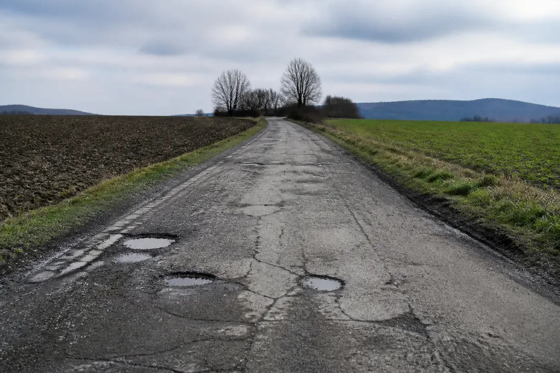
On a strategic map there are several hundred kilometres of front. The village from the opening is invisible. The entire sector has one colour, and a shift of several kilometres appears as a slight movement of the line. The map answers the question: where are the principal areas of advantage, and what is the overall direction of change?
On a operational map cities, rivers, main roads, railways and terrain obstacles appear. The same shift may now reveal that one side has reached a road hub or cut a direct route. This map answers the question: what does the change mean for movement, supply and the spatial system as a whole?
On a local map the line expands into a belt. Individual houses, the forest edge, a ridge, culvert, farm track and field of observation become visible. We discover that the main road is not fully passable even though the village has an unambiguous colour on the strategic map. This map answers the question: how is this particular space actually being used?
None of these maps need be a correction of the one before it. Each abstracts differently. Error begins only when we digitally zoom into the strategic map and infer the situation at an individual house from its coloured pixels. Enlarging an image does not add resolution to the underlying data.
Modern geospatial products therefore work with layers, metadata, sources, accuracy, currency and intended use. A US Army publication on geospatial intelligence notes that products may range from a simple map to a multilayered output tailored to a specific requirement; it also stresses database updates, data provenance and the suitability of resolution for the intended purpose.[4]
The same space, three different questions
The closer we look, the less the front resembles a line—and the more it resembles a web of relationships.
08 A map always arrives from the past
Every conflict map contains at least two times. The first is the time of the situation it is trying to capture. The second is the time of publication. Between them lie collection, transmission, sorting, verification, comparison and editorial judgement.
A fast map may be more current but more vulnerable to false reports. A cautious map may be more accurate but depict a situation that has already changed. Speed, detail and confidence cannot all be maximised at once. Every mapmaker chooses a compromise among them.
Sources do not observe the same thing, either. A satellite image captures visible objects at a particular moment. A geolocated recording may confirm presence at one location, not enduring control of the surroundings. An official report has institutional access, but also its own vocabulary and interests. A witness on the ground may be immediate, yet limited by line of sight and conditions. Multiple sources reduce some forms of uncertainty; they do not eliminate them all.
That is why a timestamp matters as much as a legend. “Updated today” is not enough if we do not know whether the data describe this morning, last night or the most recent confirmed state from several days ago. A map without time presents itself as the present when it is really a version of the past.
Uncertainty should not be attached to an entire map in a single blanket sentence. Different sectors may rest on evidence of different quality. One area may be confirmed by several independent sources, another estimated from indirect signals, and a third left unchanged simply because no new information arrived. The same colour saturation can therefore conceal very different levels of confidence.
A map is a version, not a verdict
Serious reading begins with the question: To what time, scale, definition of control and level of confidence does this drawing refer?
09 What a map can do—and what it can never tell us
It would be easy to arrive at the striking line that maps lie. But that would be as imprecise as the worst maps the statement is meant to criticise.
Maps are indispensable. They reveal spatial relationships that would remain invisible across thousands of reports. They show how routes connect, distances, obstacles, concentrations of events and change over time. Without simplification, we would not understand a conflict better. We would not understand it at all.
A good map can reasonably answer questions such as: Under the stated methodology, where does one side exercise predominant control? Where has the situation changed since the previous version? Which areas are contested? How do changes relate to rivers, towns, roads and terrain? What degree of confidence is declared, and how old is the underlying evidence?
From a single map, however, we usually cannot tell who is inside a particular house at this moment. We cannot know whether a road is safe for a civilian. We cannot read the morale of units, the quality of command, supplies, local willingness to cooperate or the price paid to take a position. Nor can we infer the legitimacy of political claims, legal responsibility, the causes of the conflict or the lived experience of people beneath the coloured area.
Still less does a larger coloured area automatically mean that victory is approaching. A territorial map is only one model of war. Another might track logistics, personnel, industrial capacity, airspace, information networks, political cohesion or time. Each would draw a different geometry of power.
Before accepting a clean map as clean reality, then, it is worth asking a few simple questions:
- How does the author define control? By presence, administration, movement or sustainable possession?
- To what time do the data actually belong? Not merely when the graphic was published.
- What do the arrows and shades mean? Observation, estimate, intent or change between versions?
- What are the scale and resolution of the underlying data? What has been merged, displaced or omitted?
- How is uncertainty represented? Is there a contested category, interval or confidence information?
- What exactly do the percentages measure? Area, districts, population or a window selected by the author?
- Which strategically important points disappear inside the aggregate area figure?
These questions do not diminish the map. They restore its proper function. The map ceases to be an image meant to replace reality and becomes a tool for asking a more precise next question.
10 A straight line above an uneven reality
Return to the village from the opening: the small unit at its edge, the drone above the road, the artillery range, the forest that cannot be crossed safely, and the people whose lives beneath one colour are far more complicated.
The cartographer must ultimately put this place on the map. A single pixel cannot contain every hour, every capability, every source or every doubt. A scale, time, category and confidence threshold must be chosen. A legible answer has to be made from a complicated space.
That is not a failure of the map. That is its job.
Failure begins on our side, when we forget that a colour is a classification, an arrow a claim, a percentage has a denominator and a line has a thickness that the graphic often conceals. When we begin to mistake the model for the territory itself.
A line on a map is not the front. It is our best provisional answer to the question of where, within a complicated reality, the boundary of control currently lies.
And the cleaner we draw that line, the easier it becomes to forget how untidy the reality beneath it is.